Some of the back designs from the cards I bought to make Dazzle gimmicks are really nifty. Its quite a shame that a lot of those cards simply don’t have the right texture for a lot of magic tricks.
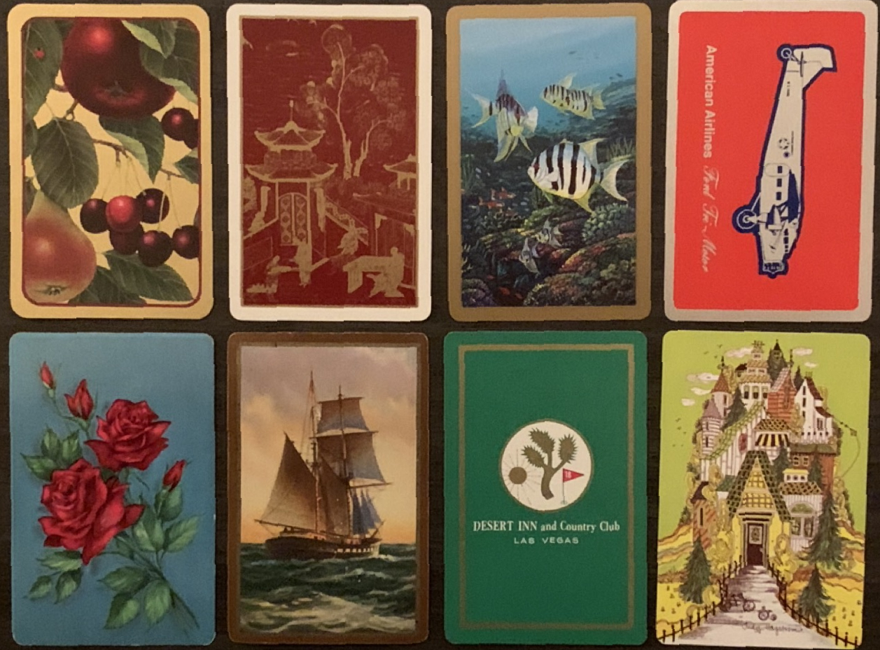
This photo doesn’t accurately capture the look of the shiny ink on certain cards. The quality of the ink really elevates the look of the airplane deck. The ink on the Desert Inn card is a lot more gold in person and pairs nicely with the green.
[Read More]